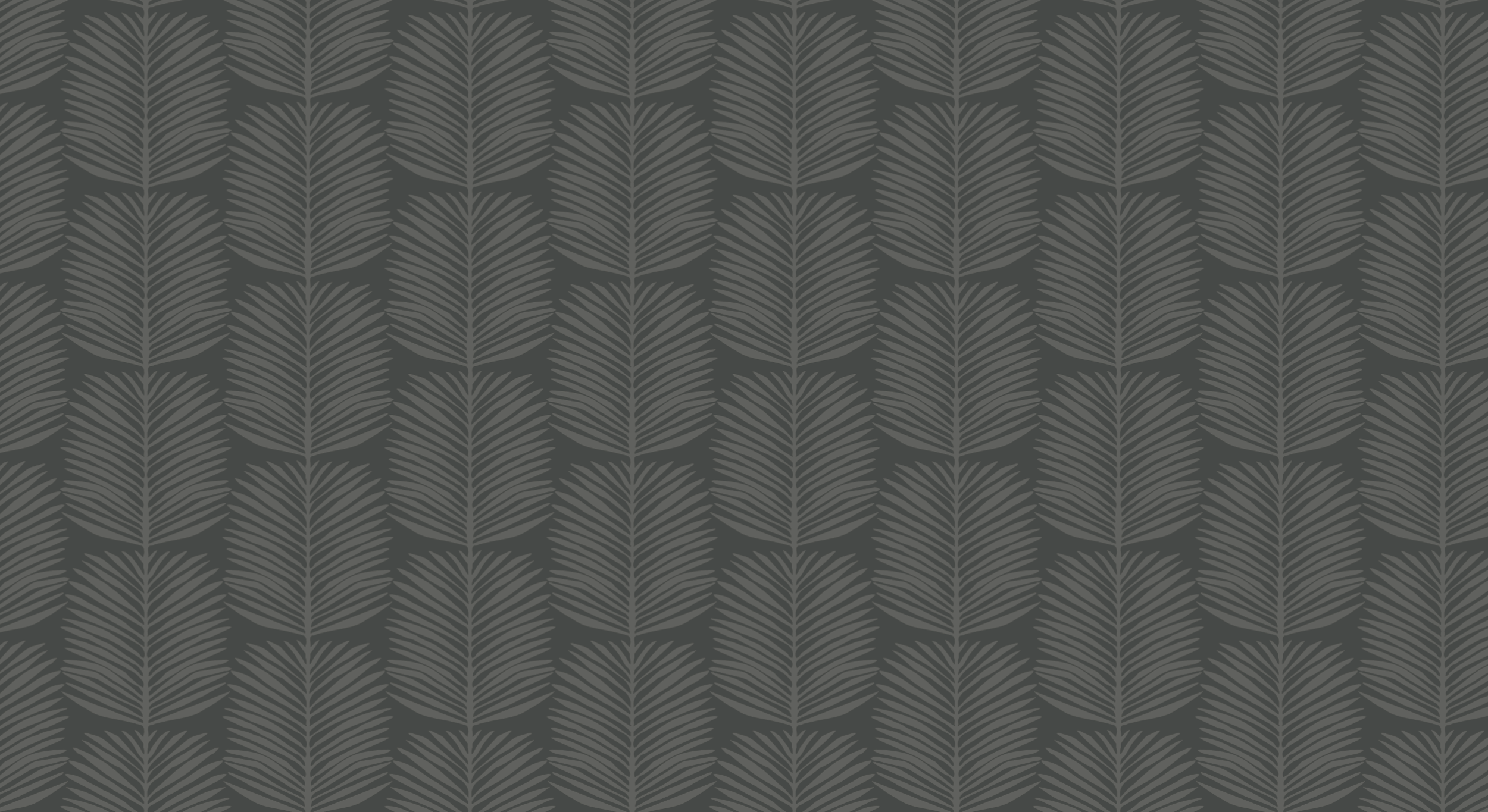
Logo and Branding
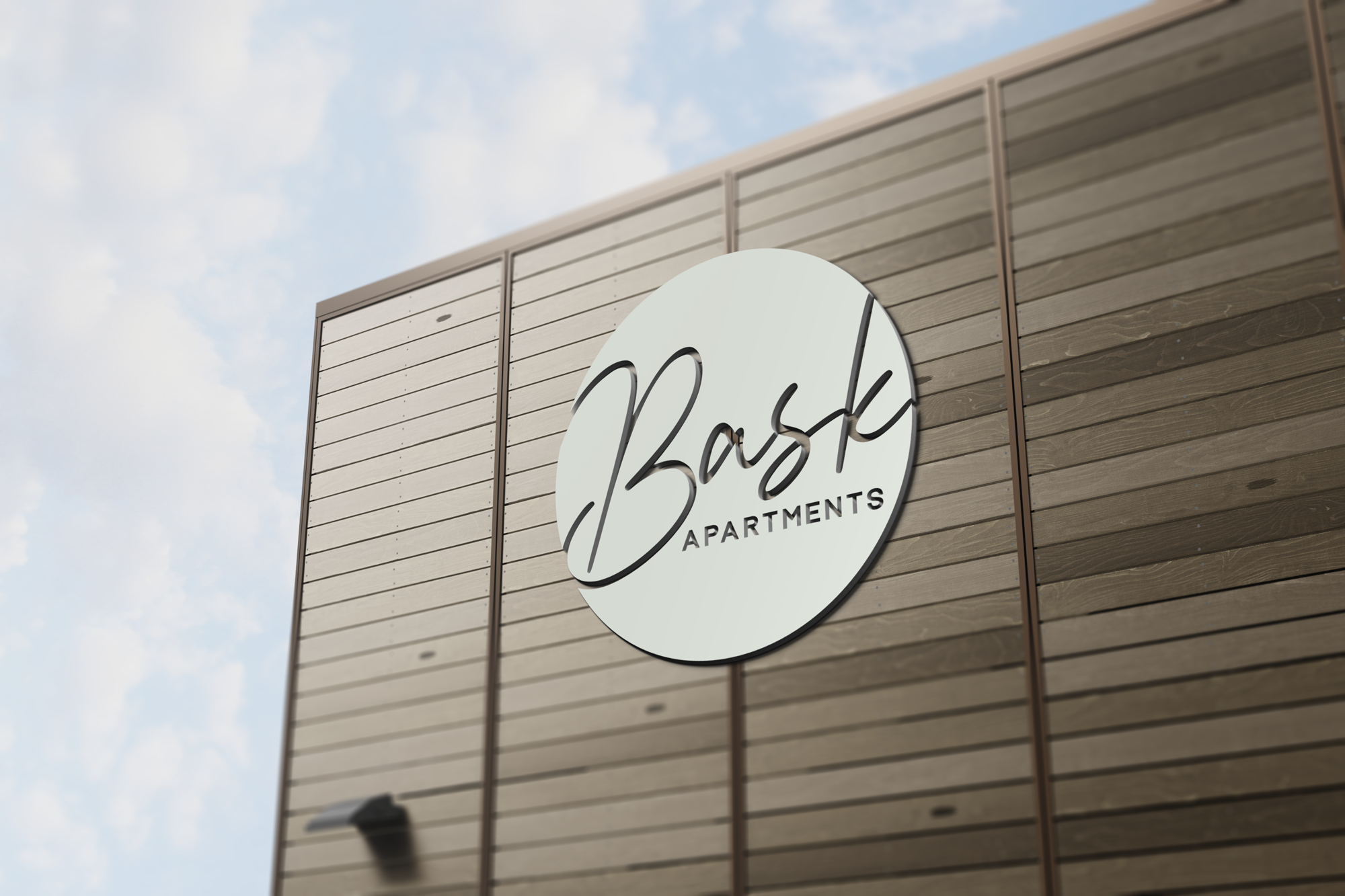
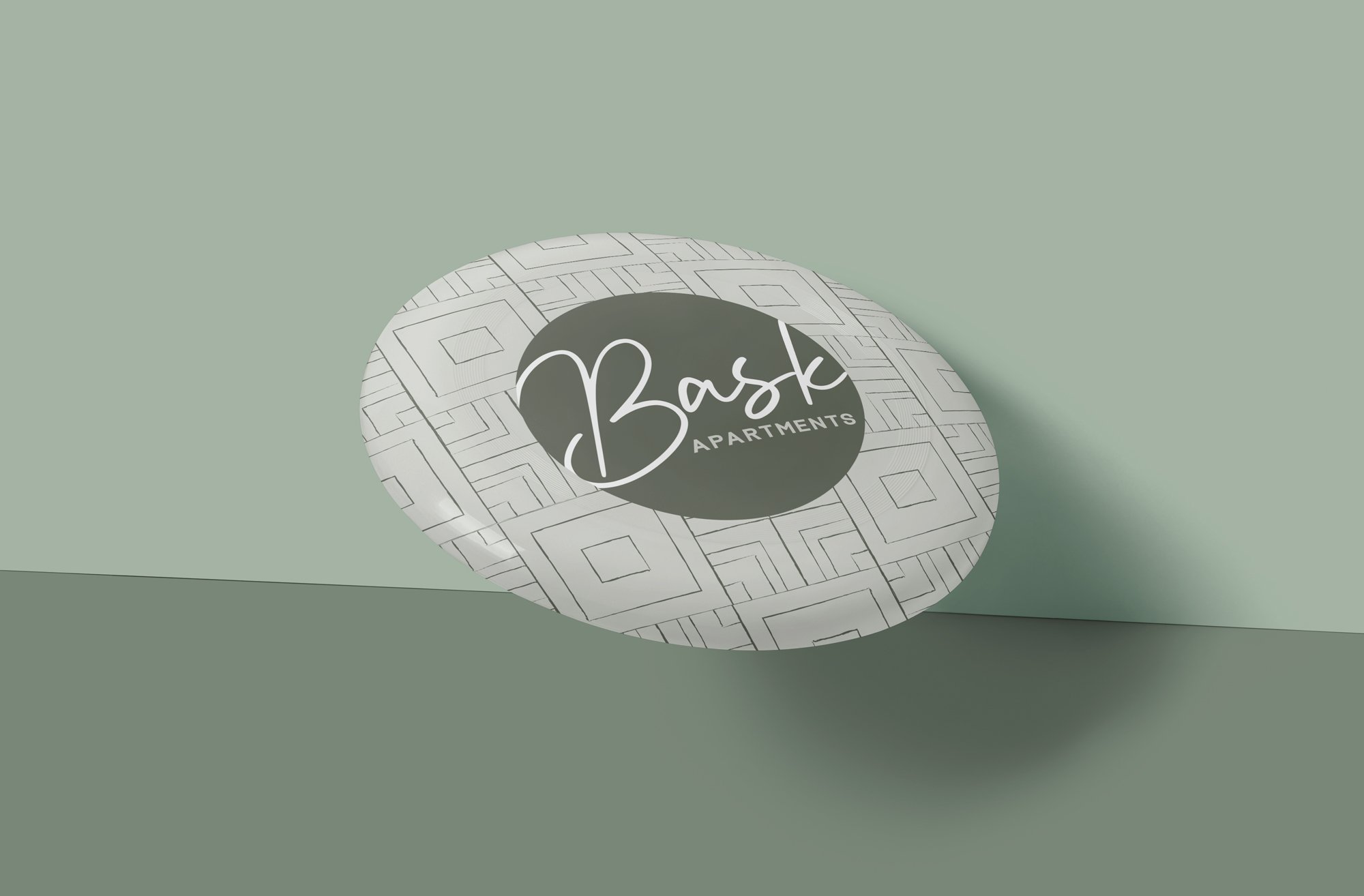
Bask
Bask Apartments’ branding mixes elegant and nature-inspired elements. The logo is a script inside a circle, evoking sunlit warmth. A fern pattern and organic geometric shapes pair natural beauty with modern polish. Together with a calming color palette, they suggest relaxed comfort and refined living, reflecting Bask’s elevated and grounded Steele Creek lifestyle.
Services: Graphic Design,
Stationery, Branding


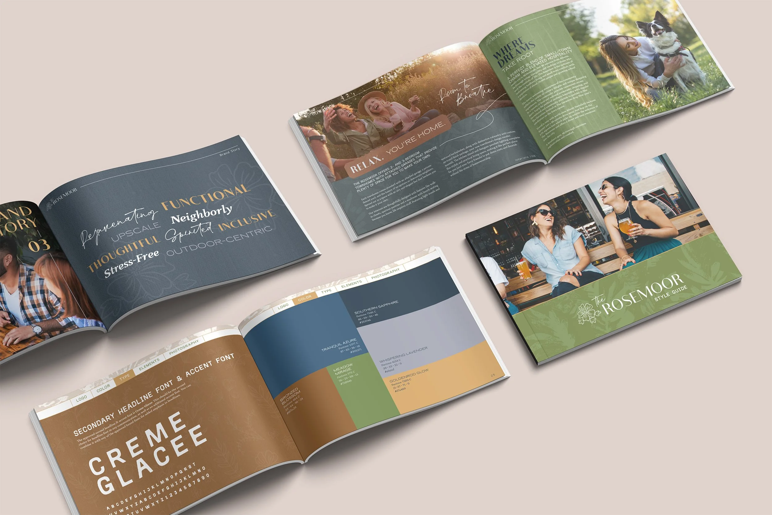
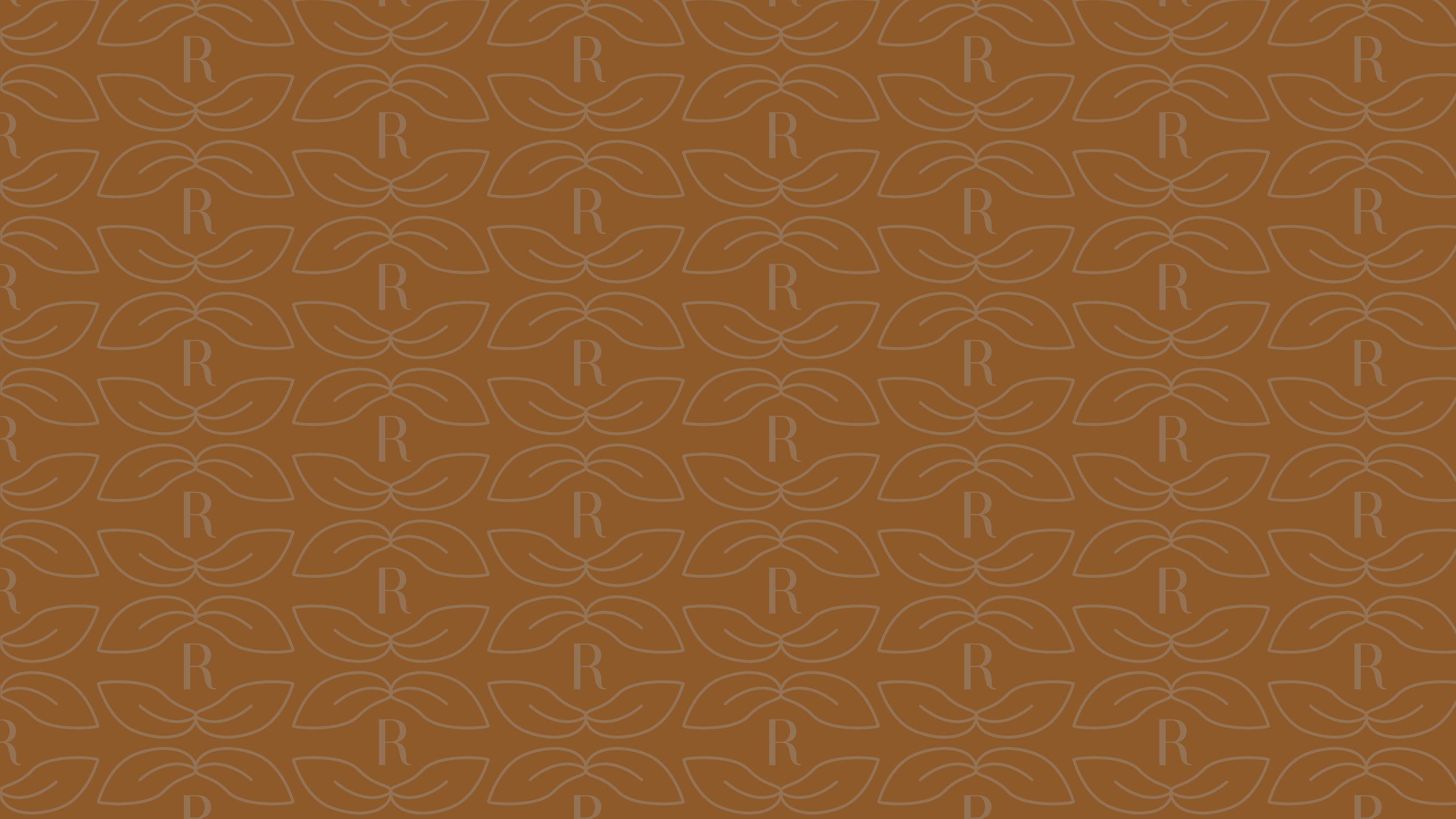
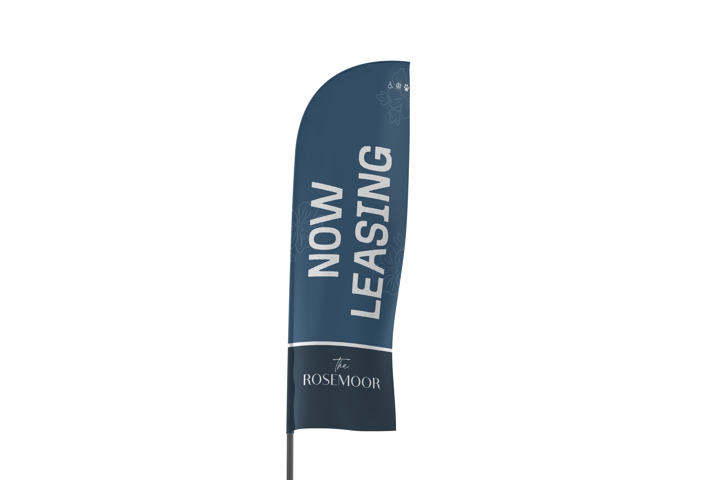
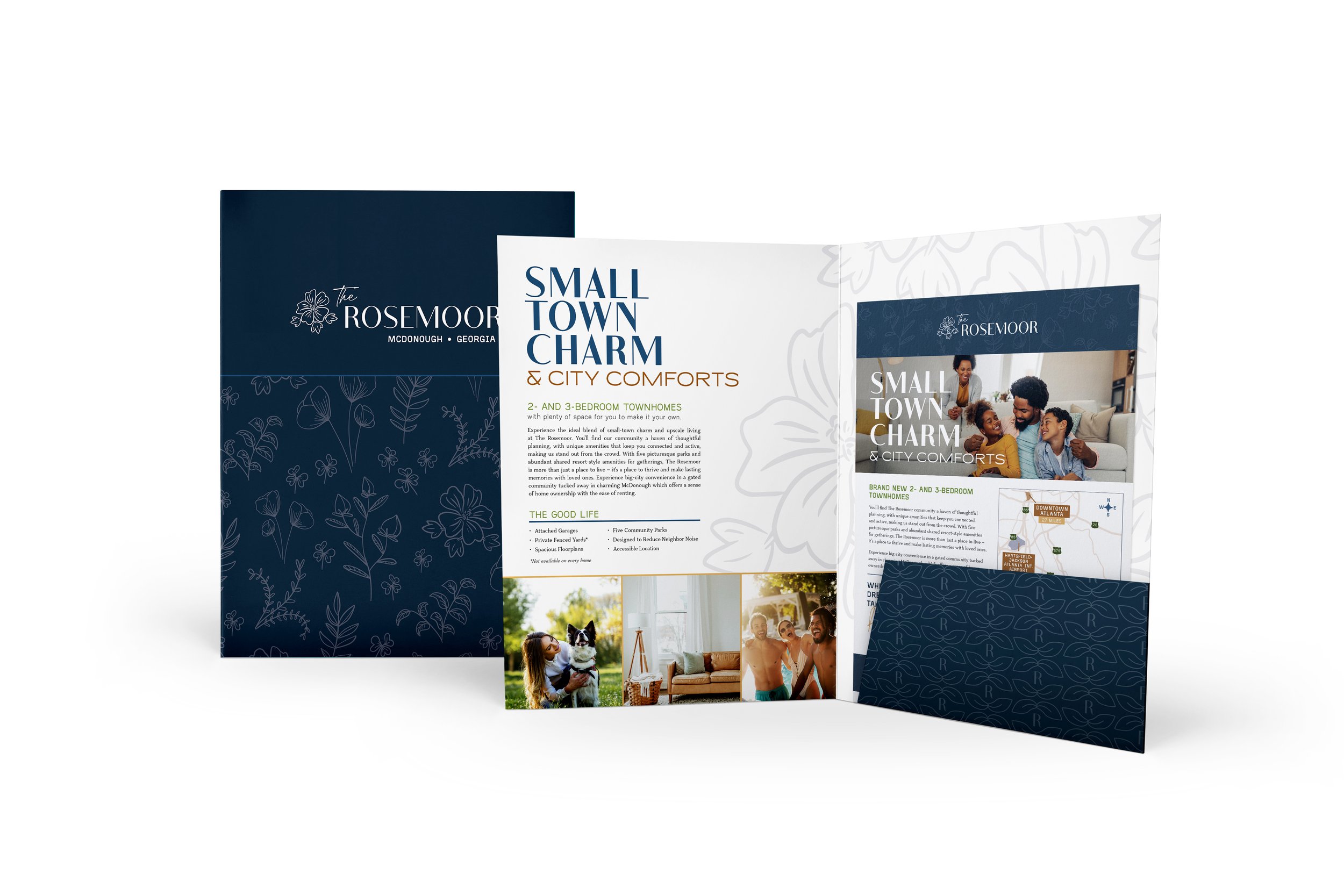
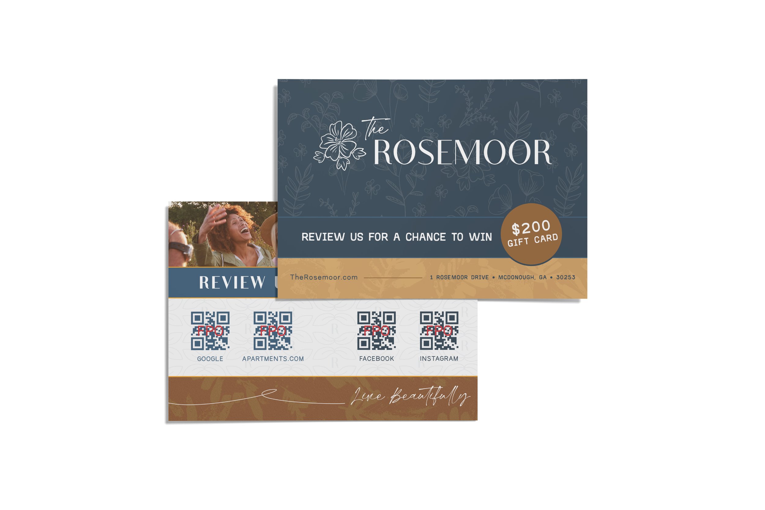
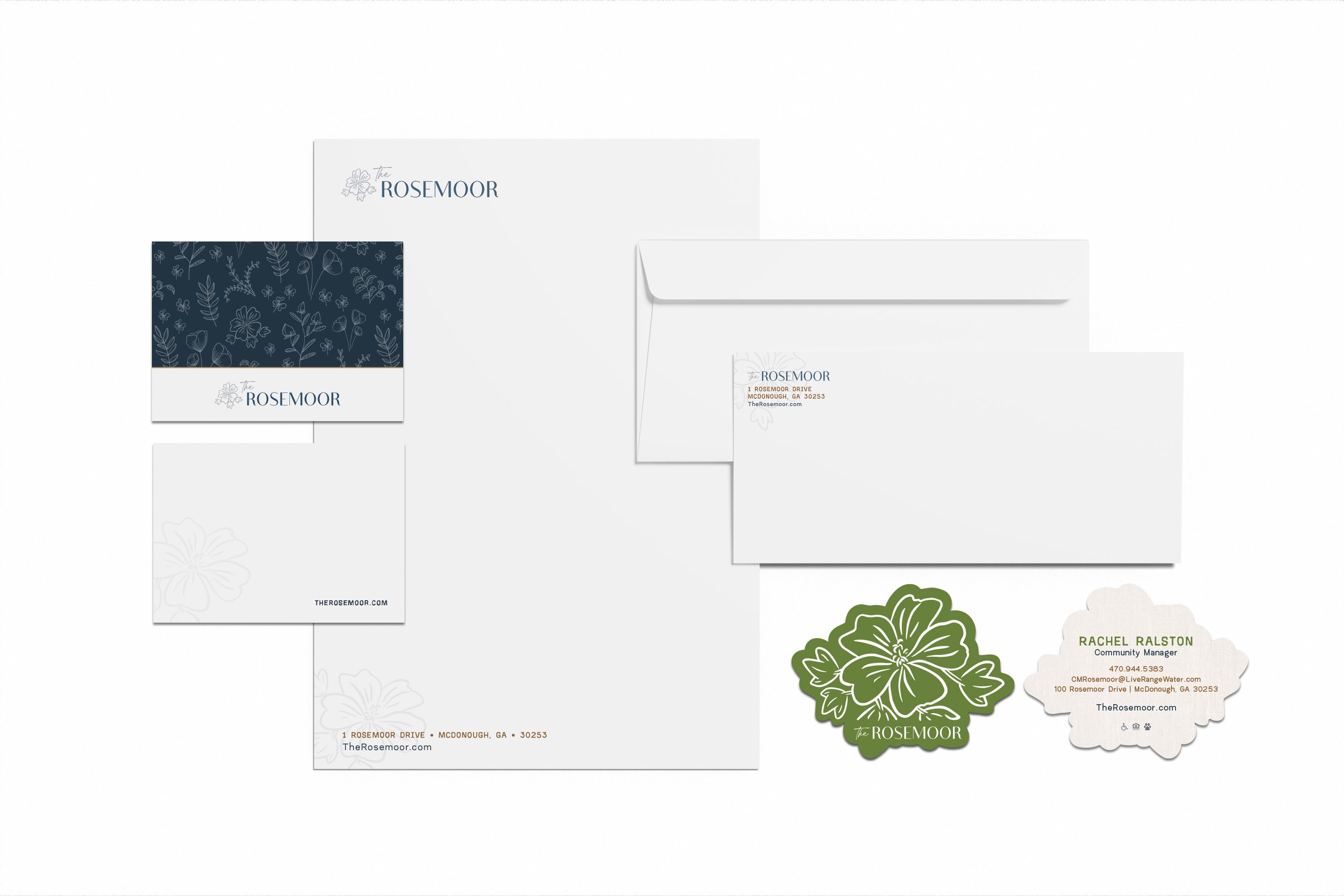
The Rosemoor
The Rosemoor brand shows classic elegance and natural beauty. Inspired by blooming gardens, it uses clean typography, balanced colors, and detailed illustrations. Each part is carefully designed to create a cohesive, charming, and memorable identity.
Services: Graphic Design,
Stationery, Branding


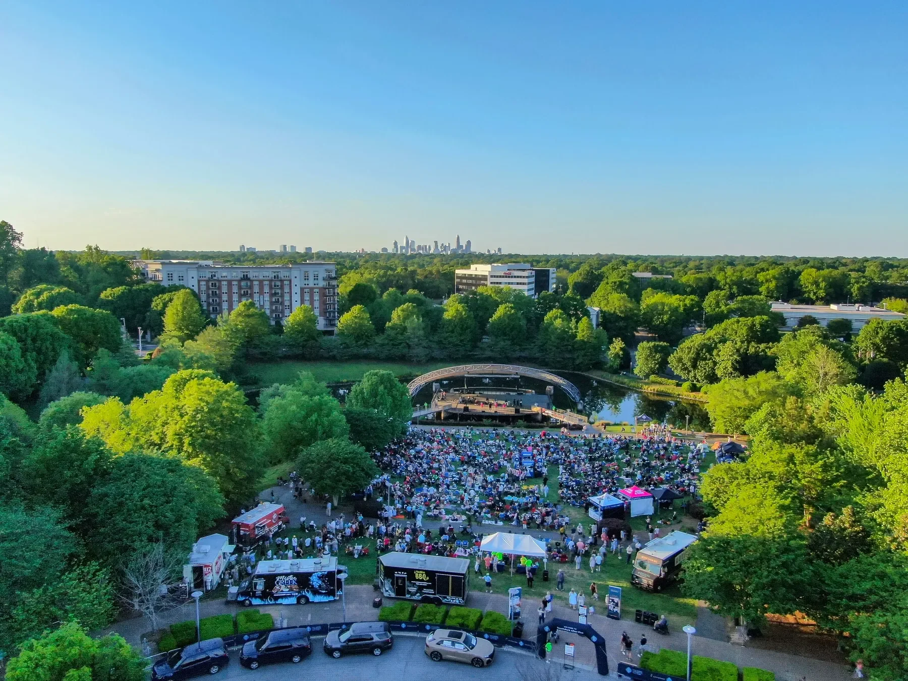
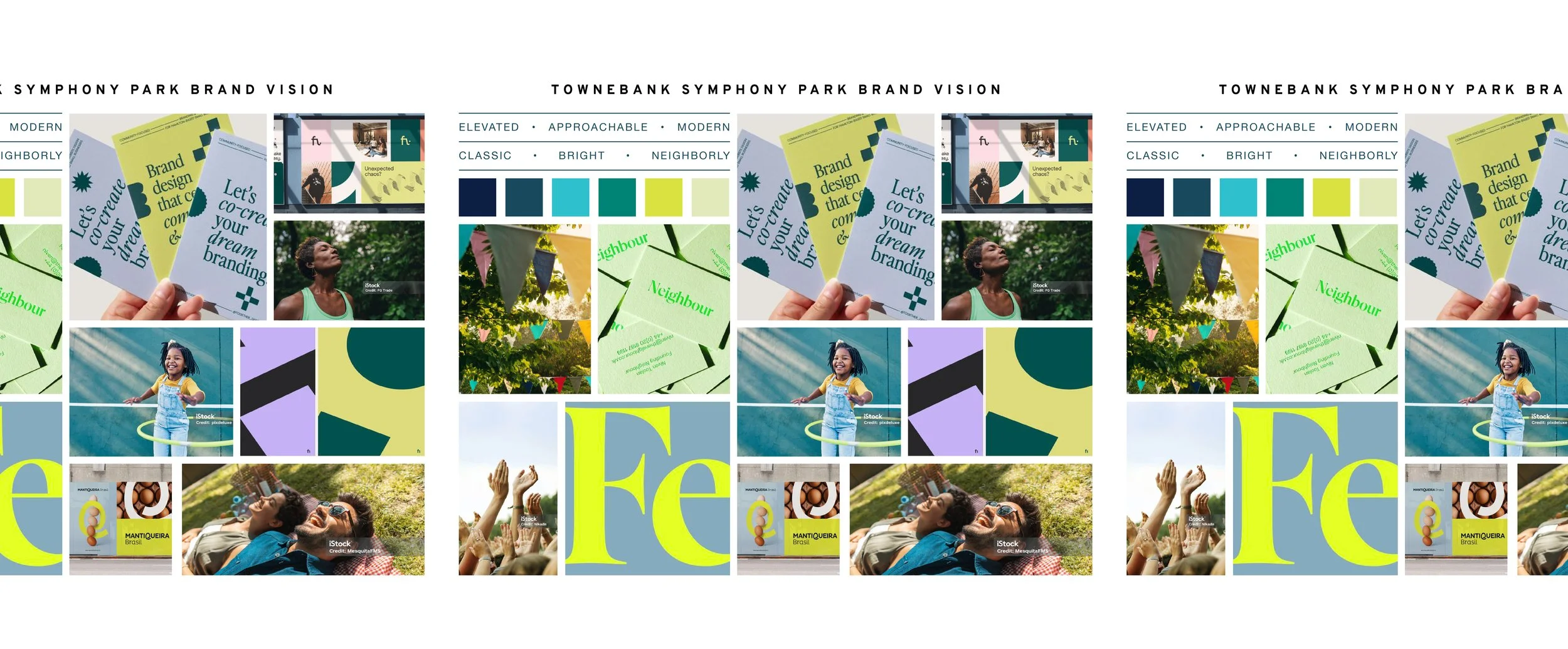
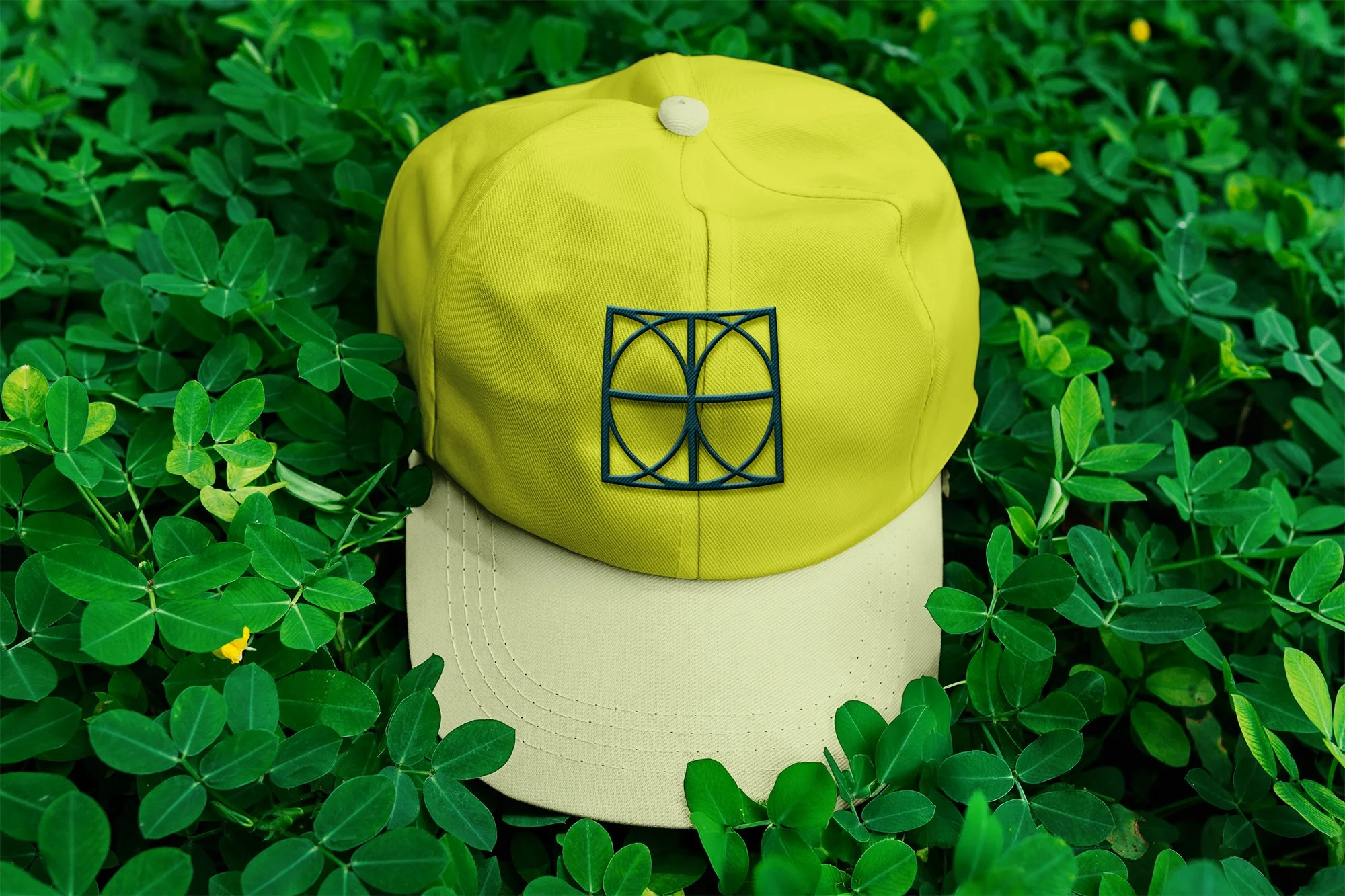
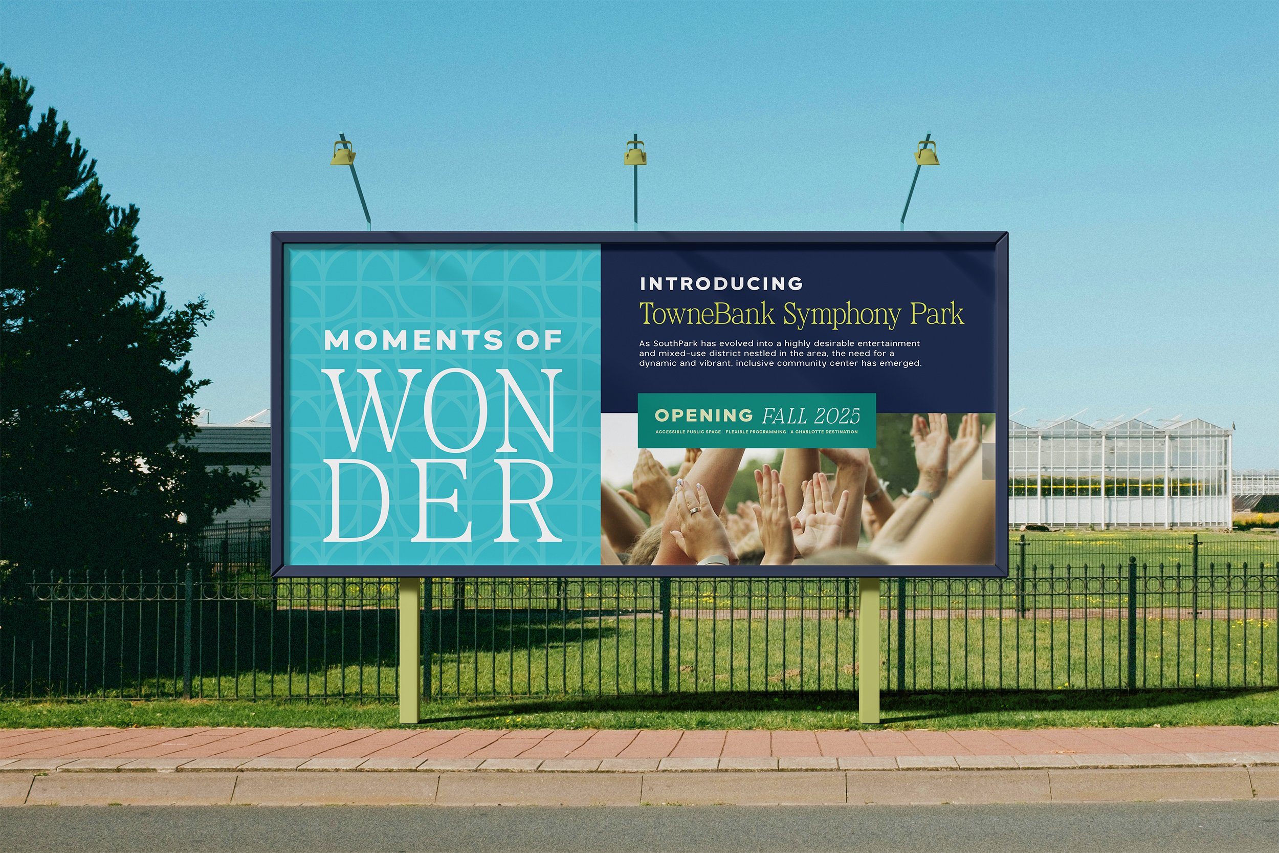
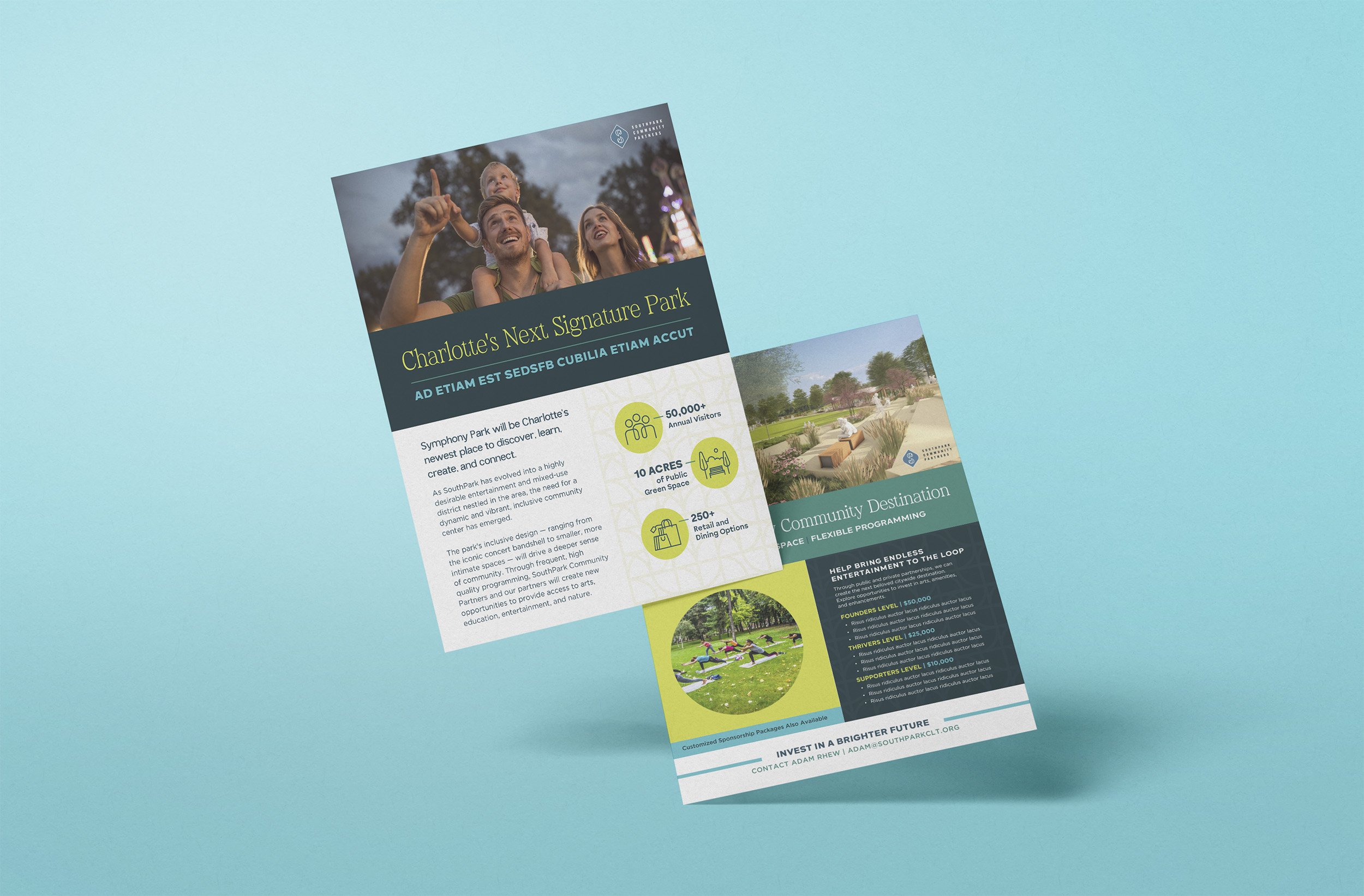
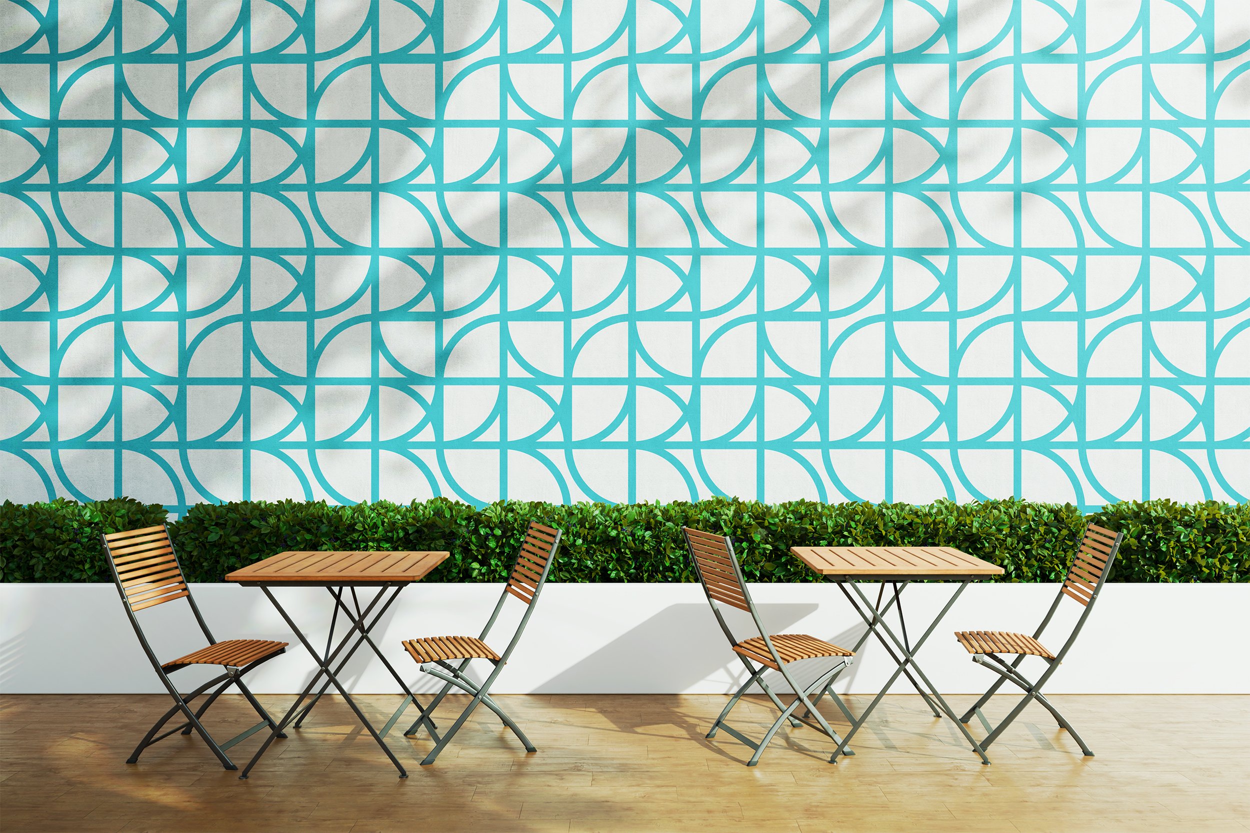
Symphony Park
Services: Branding, Art Direction,
Graphic Design
Symphony Park is a public park in Charlotte built around art, music, and community programming. It's the kind of place that already has a lot of heart, so the goal for the rebrand was to honor that while bringing in some fresh energy.
I led the art direction for this project, working through how the identity could feel both established and alive. A classic serif typeface grounds the brand with a sense of sophistication, while bright contrasting colors and playful abstract patterns reflect the movement and liveliness the park is known for. It was important that the final result felt like it belonged to Charlotte and the people who actually use the park.

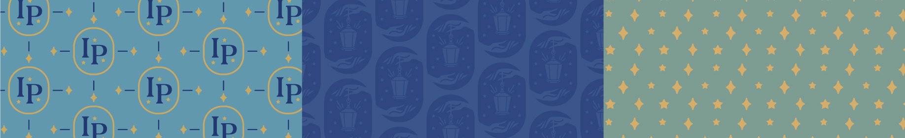
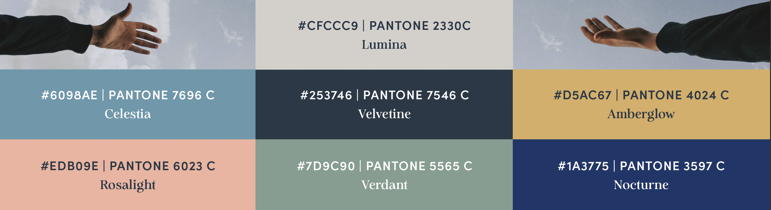
Illuminated Paths
Services: Branding
Illuminated Paths is a therapy brand that mixes spirituality with practical guidance. Its tarot-inspired logo centers on a lantern, symbolizing the guiding light clients seek on their path to self-discovery and healing. The brand uses friendly, thoughtful fonts and a calm, mystical look to create a comforting, inspiring atmosphere. Illuminated Paths invites people to explore themselves with the promise of clarity and support at every step.